Dec 5, 2016
- Provide an appropriate response.
- 1. Suppose you are comparing frequency data for two different groups, 25 managers and 150 blue collar workers. Why would a relative frequency distribution be better than a frequency distribution?
Possible answer - 2. Create an example displaying data in a pie chart. Display the same data in a Pareto chart. Which graph is more effective? List at least two reasons in support of your choice.
Possible answer
- 1. Suppose you are comparing frequency data for two different groups, 25 managers and 150 blue collar workers. Why would a relative frequency distribution be better than a frequency distribution?
- Solve the problem.
- 3. Using the employment information in the table on Alpha Corporation, find the class boundaries for class 26-30.
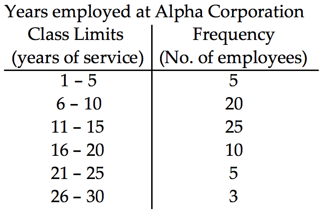
- 26.5, 29.5
- 26.5, 30.5
- 25.5, 20.5
- 25.5, 30.5
- 4. Using the information in the table on home sale prices in the city of Summerhill for the month of June, find the class midpoint for class 235.0-265.9.
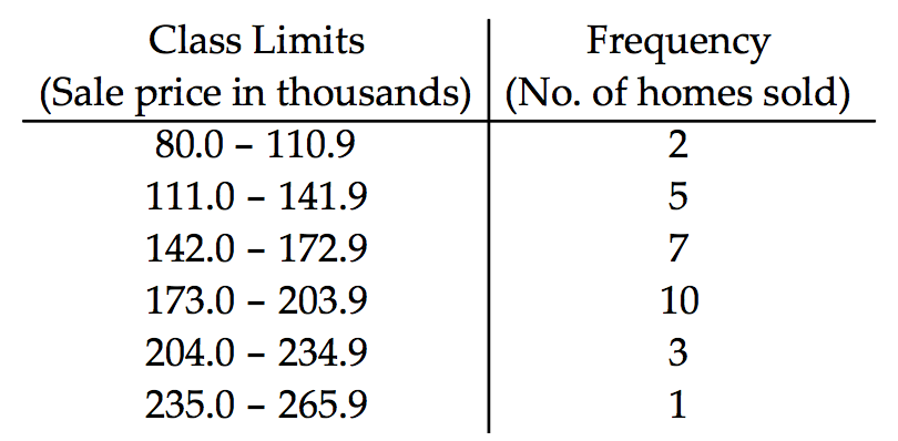
- 250.50
- 250.45
- 250.55
- 250.40
- 3. Using the employment information in the table on Alpha Corporation, find the class boundaries for class 26-30.
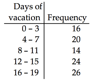
- Construct the cumulative frequency distribution that corresponds to the given frequency distribution.
- 5.
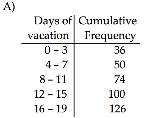
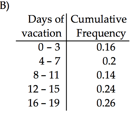
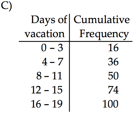
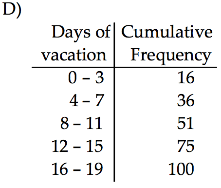
- the cumulative frequency distribution C
- the cumulative frequency distribution D
- the cumulative frequency distribution A
- the cumulative frequency distribution B
- 5.
- Use the given data to construct a frequency distribution.
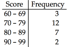
- 6. On a math test, the scores of 24 students were
98 72 71 64 71 71 98 84 71 68 81 72
72 81 71 72 81 71 72 84 72 81 84 64
Construct a frequency table. Use 4 classes beginning with a lower class limit of 60.
Possible answer
- 6. On a math test, the scores of 24 students were
- Provide an appropriate response.
- 7. Sturges’ guideline suggests that when constructing a frequency distribution, the ideal number of classes can be approximated by 1+(log n)/(log 2), where n is the number of data values. Use this guideline to find the ideal number of classes when the number of data values is 150. Round you answer to the nearest whole number.
- 7
- 8
- 9
- 6
- 8. What common class width was used to construct the frequency distribution?
A nurse measured the blood pressure of each person who visited her clinic. Following is a relative-frequency histogram for the systolic blood pressure readings for those people aged between 25 and 40. Use the histogram to answer the question. The blood pressure readings were given to the nearest whole number.
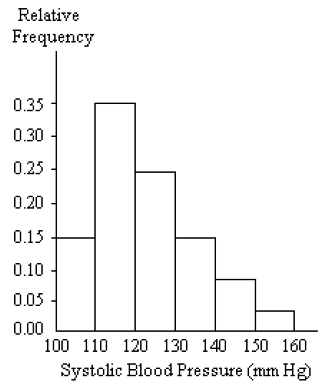
- 10
- 11
- 100
- 9
- 7. Sturges’ guideline suggests that when constructing a frequency distribution, the ideal number of classes can be approximated by 1+(log n)/(log 2), where n is the number of data values. Use this guideline to find the ideal number of classes when the number of data values is 150. Round you answer to the nearest whole number.
- Provide and appropriate response.
- 9. Construct a frequency distribution that includes an outlier. Construct the corresponding histogram. Then, construct the corresponding histogram without including the outlier.
How much does the outlier affect the shape of the histogram? - Possible answer
- 9. Construct a frequency distribution that includes an outlier. Construct the corresponding histogram. Then, construct the corresponding histogram without including the outlier.
- Use the pie chart to solve the problem.
- 10. A survey of the 9189 vehicles on the campus of State University yielded the following circle graph.
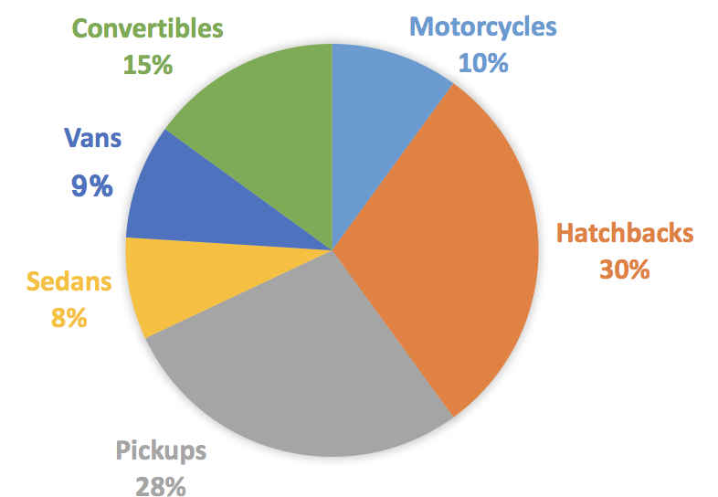
- Find the number of convertibles. Round your result to the nearest whole number.
- 1378
- 919
- 15
- 7811
- 11. The pie chart below gives the number of students in the residence halls at the state university.
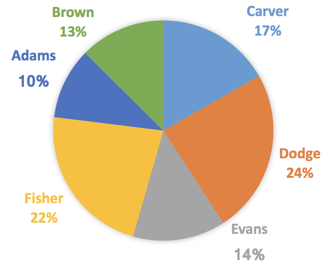
- Write the ratio of the number of residents at Brown to the number of students at Adams?
- 24/191
- 6/5
- 5/6
- 144/191
- 10. A survey of the 9189 vehicles on the campus of State University yielded the following circle graph.
- Use the data to create a stemplot.
- 12. The weights of 22 members of the varsity football team are listed below.
144 152 142 151 160 152 131 164 141 153 140
144 175 156 147 133 172 159 135 159 148 171 -
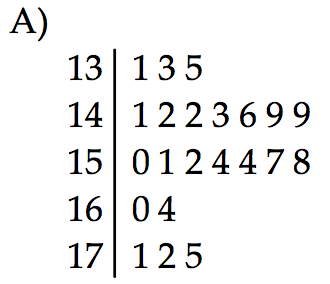
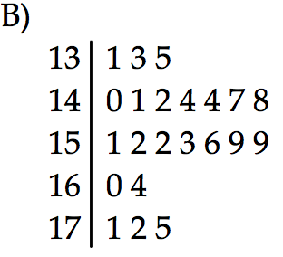
- the stemplot B
- the stemplot A
- 12. The weights of 22 members of the varsity football team are listed below.
- Construct the got plot the given data.
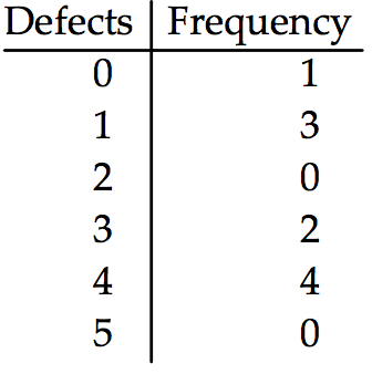
- 13. The frequency chart shows the distribution of defects for the machines used to produce a product.
-
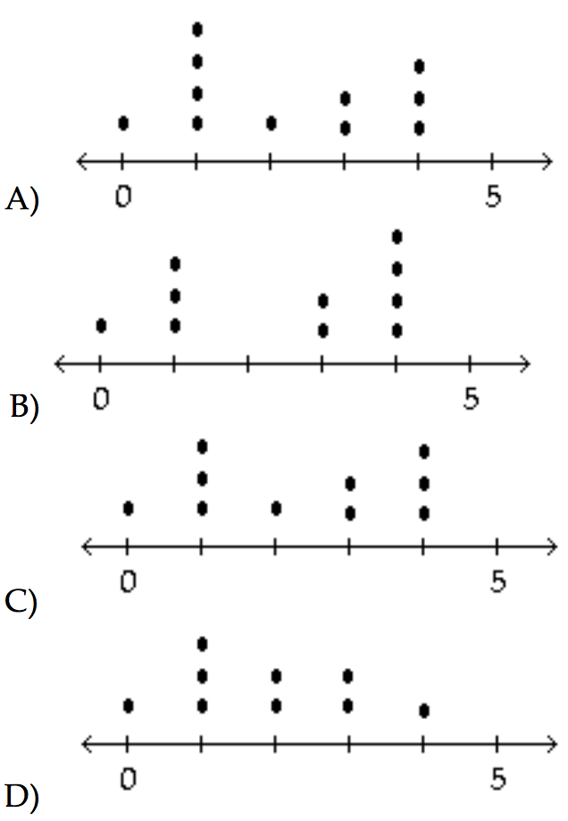
- the dot plot B
- the dot plot D
- the dot plot A
- the dot plot C
- 13. The frequency chart shows the distribution of defects for the machines used to produce a product.
- Use the data to create a stemplot.
- 14. The ages of the 45 members of a track and field team are listed below. Construct an expanded stemplot with about 8 rows.
21 18 42 35 32 21 44 25 38 48 14 19 23 22 28
32 34 27 31 17 16 41 37 22 24 33 32 21 26 30
22 27 32 30 20 18 17 21 15 26 36 31 40 16 25
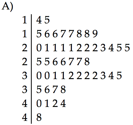
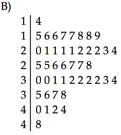
- the stemplot A
- the stemplot B
- 14. The ages of the 45 members of a track and field team are listed below. Construct an expanded stemplot with about 8 rows.
- Find the original data from the stem-and-leaf plot.
- 15.
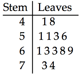
- 5, 12, 5, 5, 7, 10, 7, 7, 9, 14, 15, 10, 11, 14
- 41, 48, 51, 51, 53, 56, 61, 63, 63, 68, 69, 73, 74
- 41, 48, 53, 53, 56, 63, 64, 68, 69, 73, 74
- 43, 43, 44, 51, 51, 53, 56, 61, 61, 73, 74
- 16.
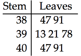
- 3847, 3891, 3913, 3921, 3978, 4047, 4091
- 85, 129, 60, 60, 117, 87, 131
- 3847, 3848, 3914, 3921, 3978, 4047, 4092
- 85, 129, 52, 60, 117, 87, 131
- 15.
- Solve the problem.
- 17. The Kappa Iota Sigma Fraternity polled its members on the weekend party theme. The vote was as follows: six for toga, four for hayride, eight for beer bash, and two for masquerade. Display the vote count in a Pareto chart.


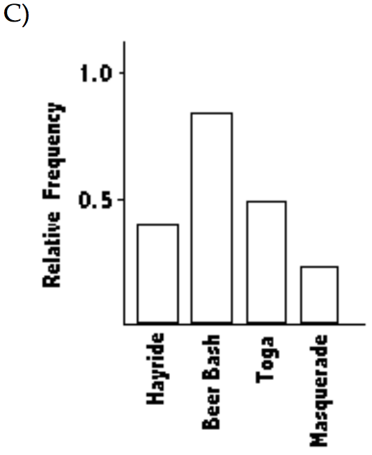
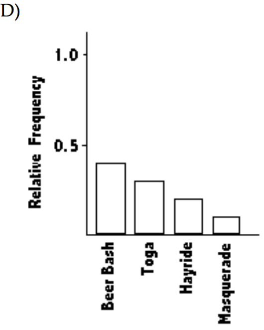
- the Pareto chart C
- the Pareto chart B
- the Pareto chart D
- the Pareto chart A
- 17. The Kappa Iota Sigma Fraternity polled its members on the weekend party theme. The vote was as follows: six for toga, four for hayride, eight for beer bash, and two for masquerade. Display the vote count in a Pareto chart.
- Construct a pie chart representing the given data set.
- 18. The following figures give the distribution of land (in acres) for a county containing 61,000 acres.
Forest — 9150
Farm — 6100
Urban — 45,750
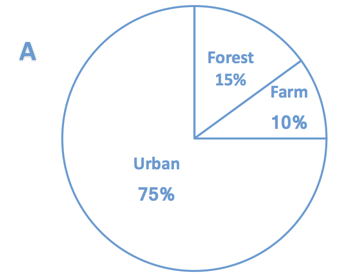
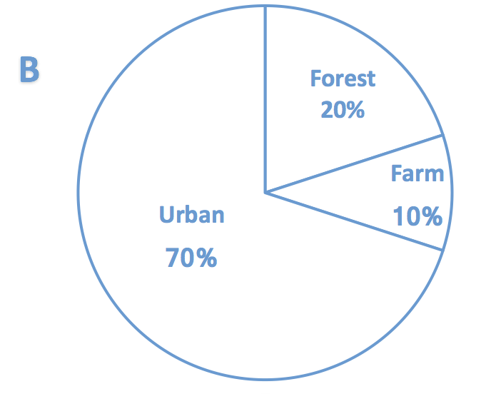
- the pie chart A
- the pie chart B
- 18. The following figures give the distribution of land (in acres) for a county containing 61,000 acres.
- Solve the problem.
- 19. A college student wants to purchase one of two stocks. She has the average annual high values for each of these stocks over the most recent ten-year period. For comparison, she decides to sketch a time-series graph. How should she prepare her graph, and what should she look for?
- Possible answer
- 20. Use the given paired data to construct a scatterplot.
x -6 4 9 5 11 7 1 -1 -5
y 3 9 11 7 9 11 7 2 3
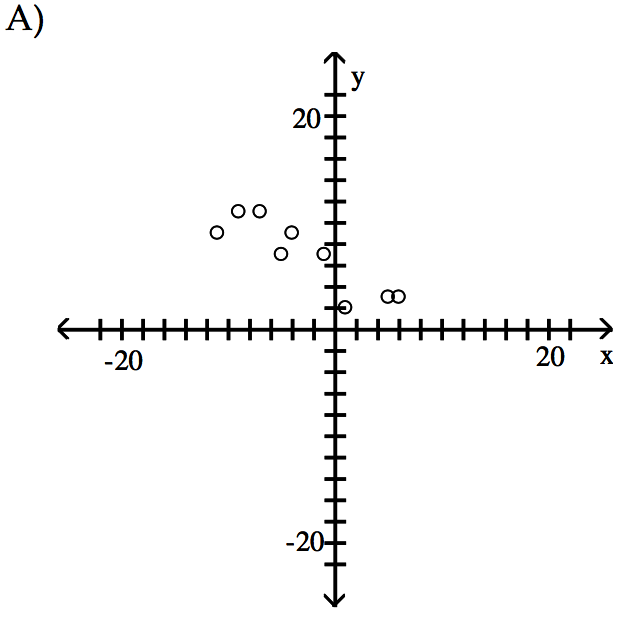
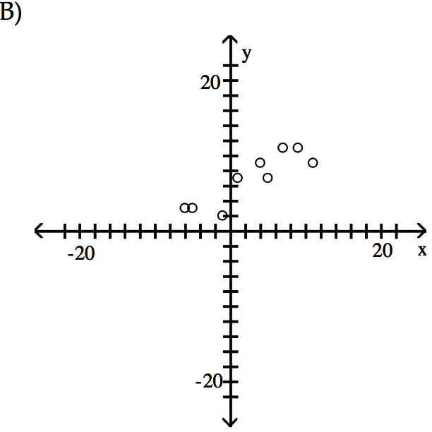
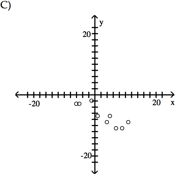
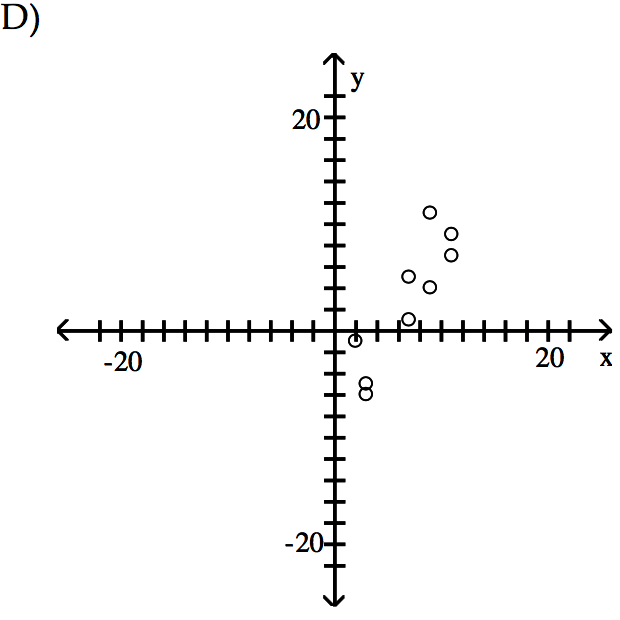
- the scatterplot B
- the scatterplot D
- the scatterplot A
- the scatterplot C
- 19. A college student wants to purchase one of two stocks. She has the average annual high values for each of these stocks over the most recent ten-year period. For comparison, she decides to sketch a time-series graph. How should she prepare her graph, and what should she look for?
arrow_backarrow_forward
© 2020 DrillPal.com